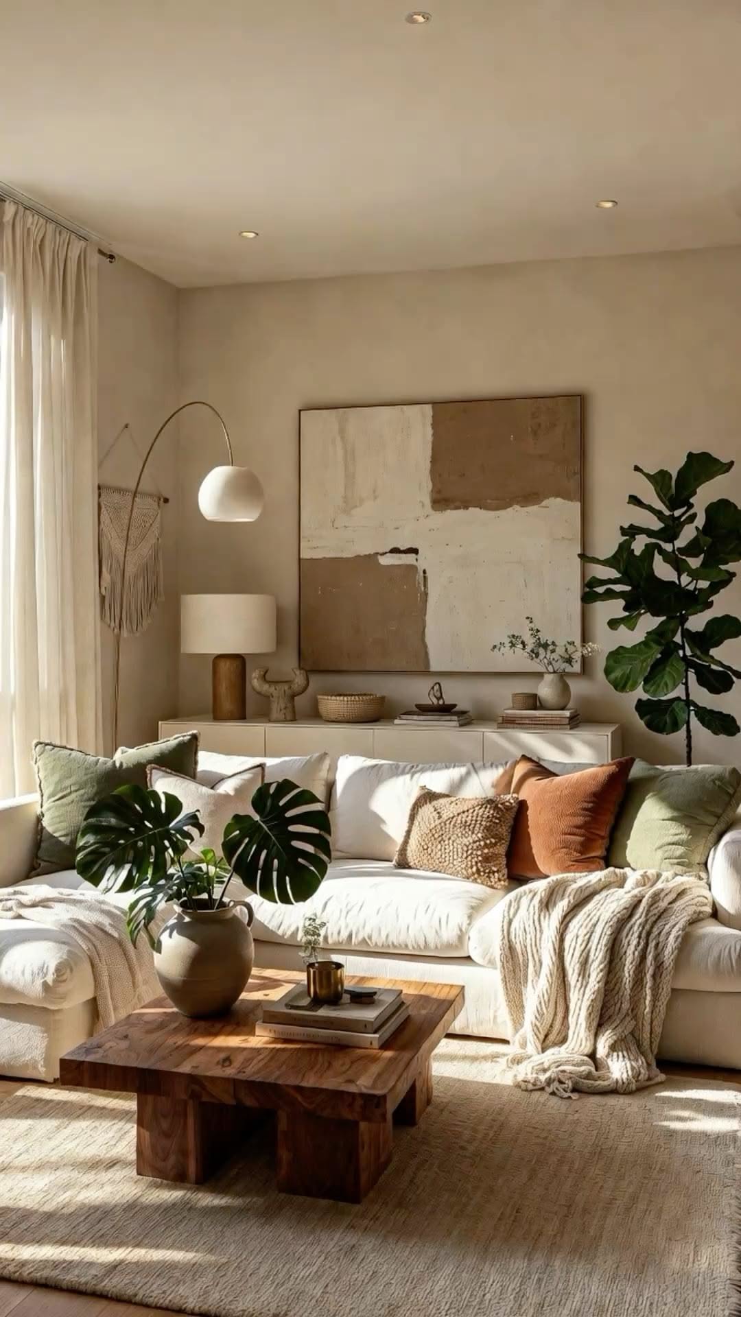
The neutral living room has a bad-faith reputation: critics call it beige and boring, while everyone secretly screenshots the good ones. The difference between bland and breathtaking is never the palette, it is the layering: texture, tone variation, warm light and a few organic shapes. Calm is the goal: flat is the failure mode. Here is how the good ones do it.
Stack the shades, not one beige
A neutral room needs at least five distinct tones doing different jobs: warm white on the walls, cream in the sofa, oatmeal and sand in the textiles, taupe or mushroom in the accents, and a grounding note of chocolate, black or charcoal in small doses (frames, a lamp base, a stripe). Single-shade rooms read like waiting areas: layered ones read like editorials. Undertones must agree: keep everything warm-based or everything cool-based, and the mysterious no-reason clash never happens.
Texture is the color
- Boucle or linen on the sofa, with cushions in velvet, chunky knit and washed cotton: same tones, different hands.
- A wool or jute rug with visible weave: the room’s textural foundation.
- Wood in at least two finishes: a pale oak table, a darker vintage piece: neutrals need wood the way tea needs a biscuit.
- Stone, ceramic and rattan accents: a travertine tray, a big earthen vase, a woven basket for throws.
The test: photograph the room in black and white. If it still looks rich, the texture is doing its job.
Warm light or nothing
Neutrals live and die by lighting: cool white bulbs turn cream into hospital, while 2700K warmth turns the same room golden. Layer three sources minimum, a floor lamp by the sofa, a table lamp on the console, candles or a small accent lamp, and retire the overhead to cloudy-day duty. Evening is when neutral rooms peak: lamplight on layered creams is the entire quiet-luxury effect in one switch flip.
Shape and life
With color quiet, silhouettes speak: a curved sofa or round coffee table, an arched mirror, sculptural lamps, one vintage piece with actual history to interrupt the newness. Then the living layer: a big green plant (the one non-neutral every neutral room needs), branches or dried grasses in a floor vase, books in warm covers, and art in tonal abstracts or line drawings. One near-black object per zone keeps the softness from floating away.
Keep it livable
The practical epilogue: choose washable covers and performance fabrics in the paler tones, let throws live in a basket rather than a museum fold, and accept that a lived-in neutral room, slightly rumpled, mug on the table, book split open on the arm, is the aspirational photo, not the untouched one. Calm is for using, not preserving.
Pin this calm palette, and layer up more home inspiration on Plumeo. Daily style at @Plumeoblog.